Every screen in the LearnHouse learning platform is worked over until it is clear, quick and pleasant to use. Here is what that care looks like.
14 days free, no card needed.
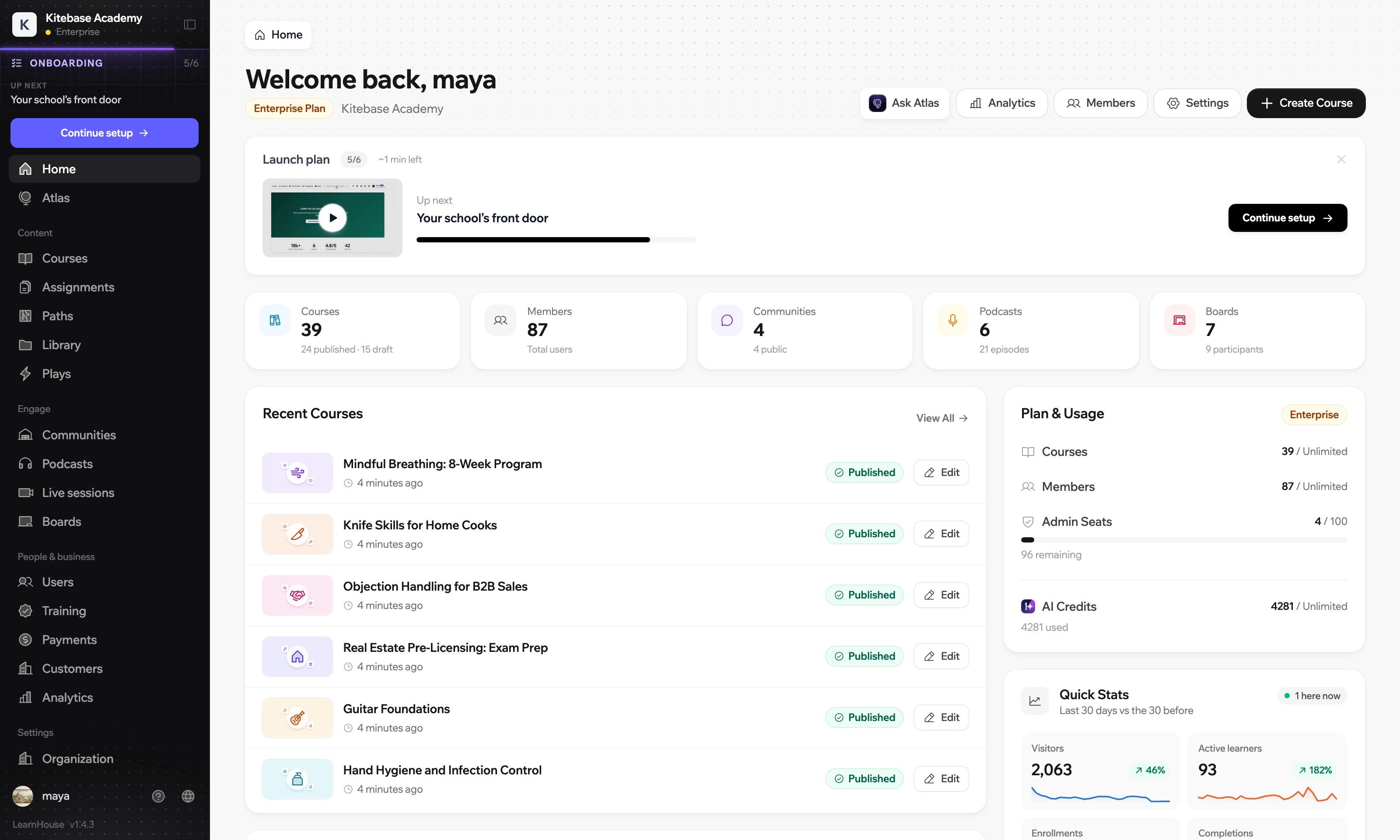
Five decisions you can point at on one course page. They hold on every other screen in the dashboard.
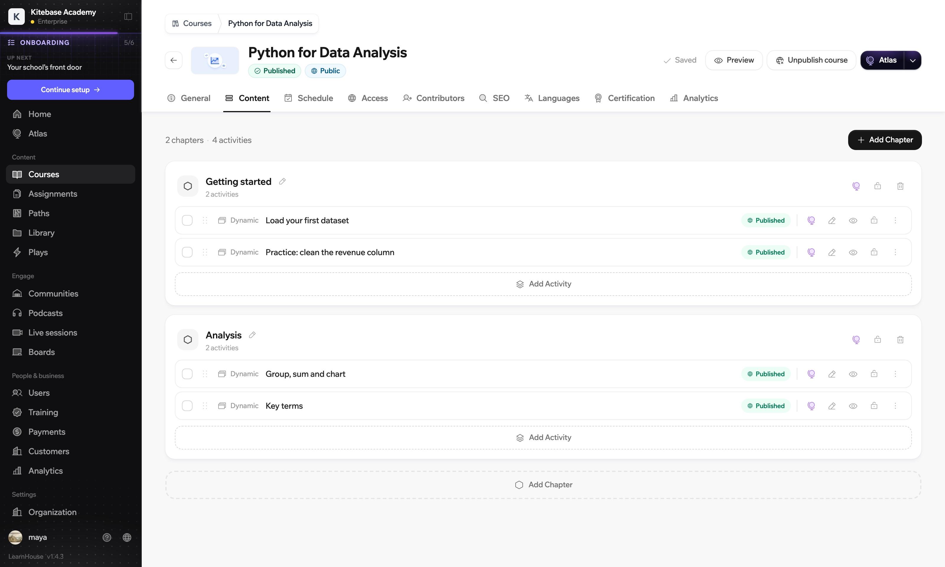
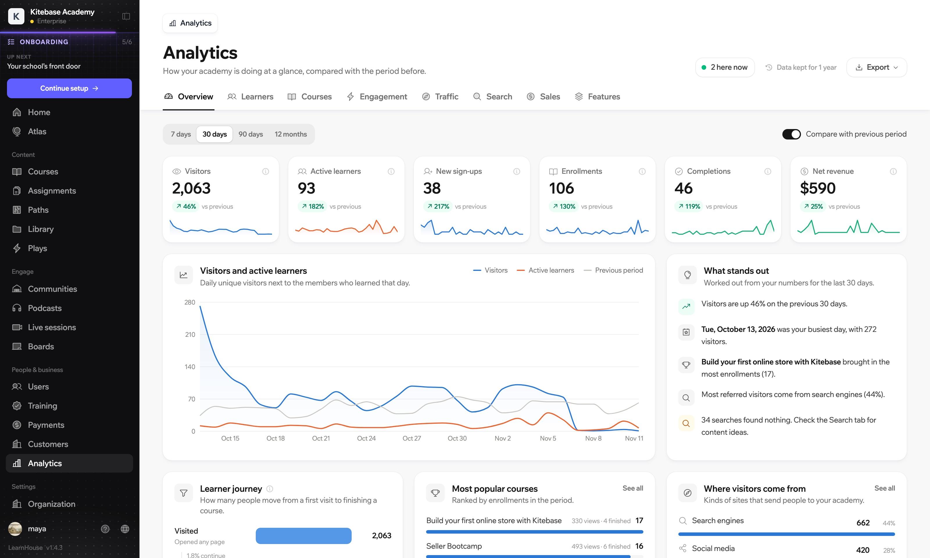
The whole dashboard is drawn from one set of cards, tabs, status chips and buttons, so a screen you have never opened already feels familiar.
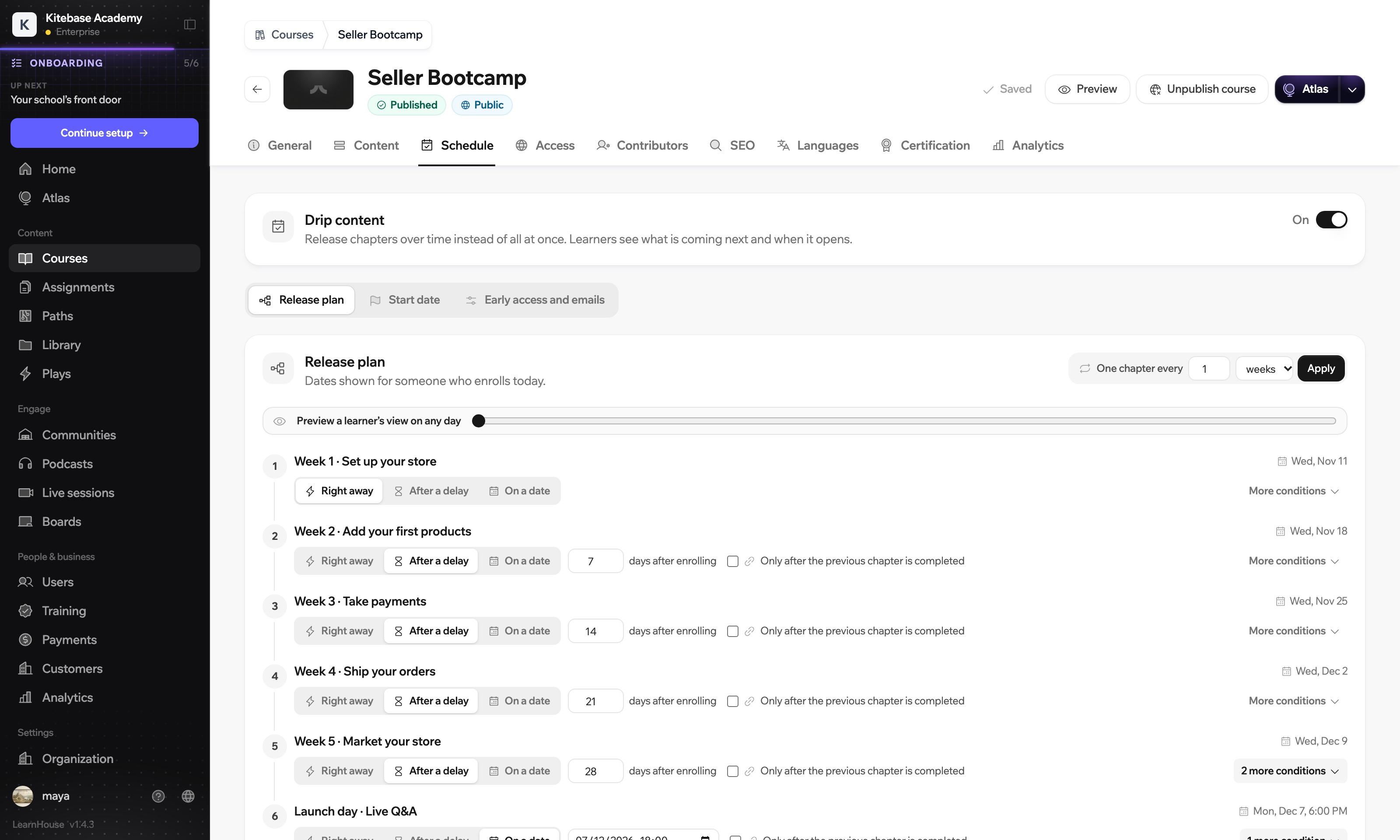
Move the slider to see what a learner has on any day.
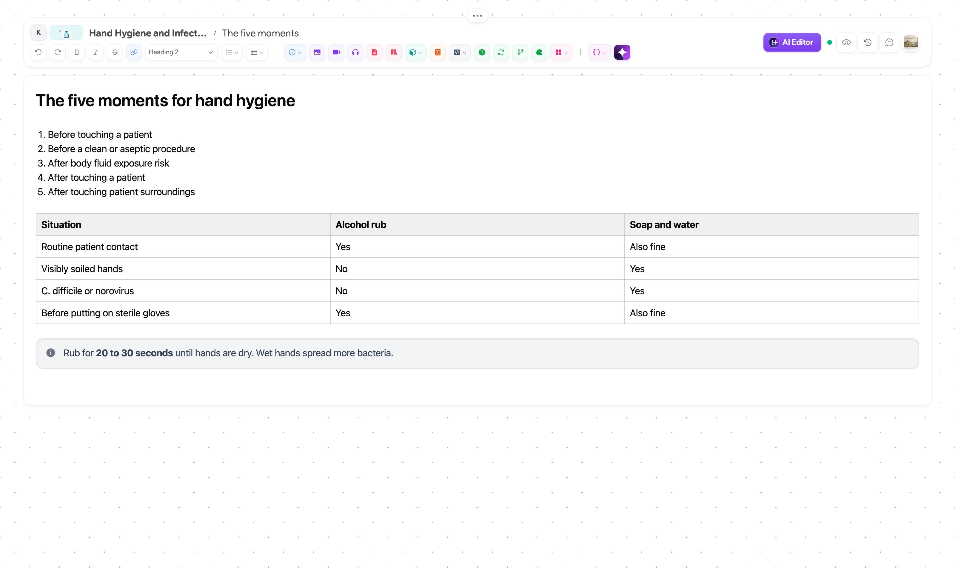
The editor is a page, not a form. Text, tables, quizzes, code and scenarios are blocks you drop in from the toolbar above it.
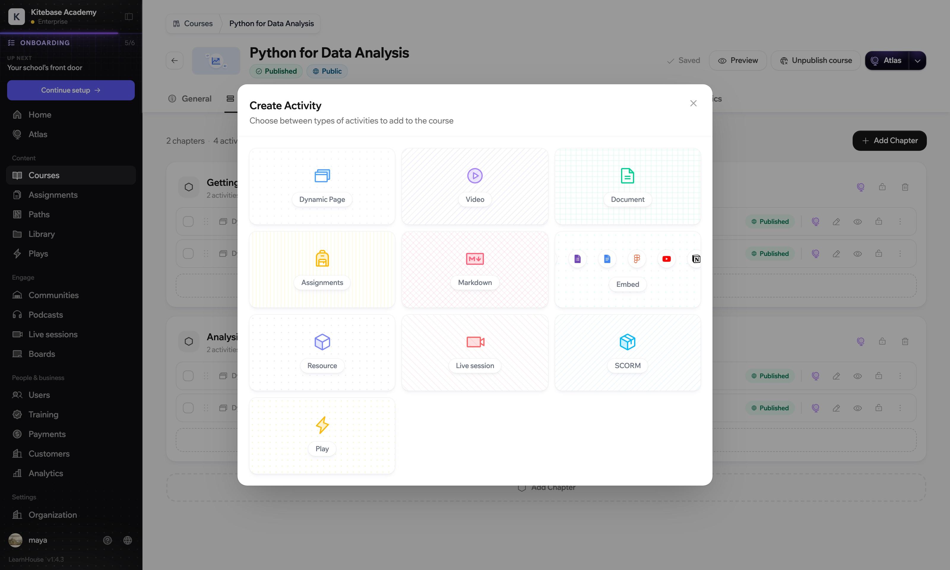
A dialog is a plane over a dimmed page, on this screen and on every other one. Scroll and the three close into the screen you use.
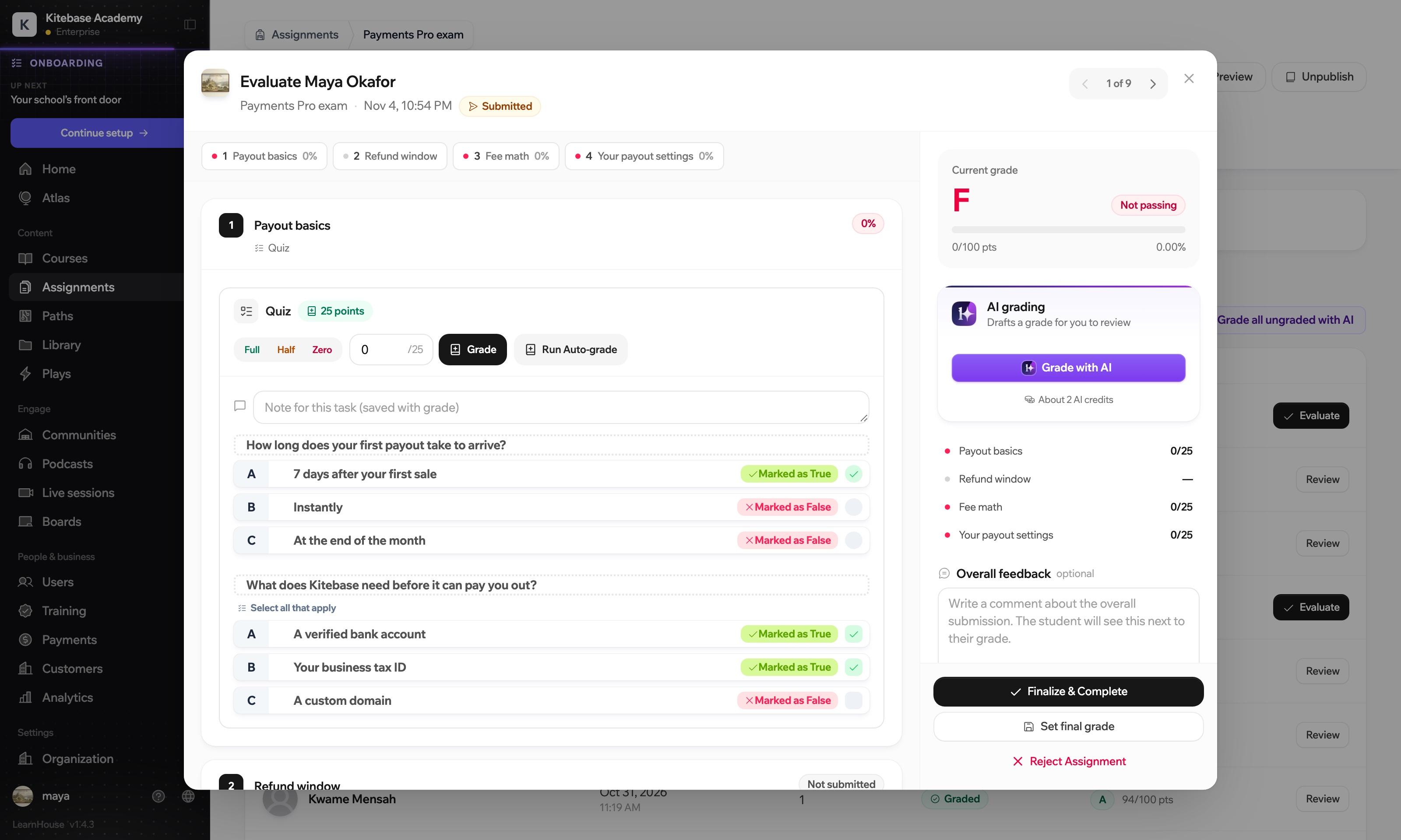
Answers on the left, the grade on the right. Full, half or zero marks take one click, and AI can draft a grade for you to review.
On the learner side the interface steps back. A progress line, the title, then the content at a reading width.
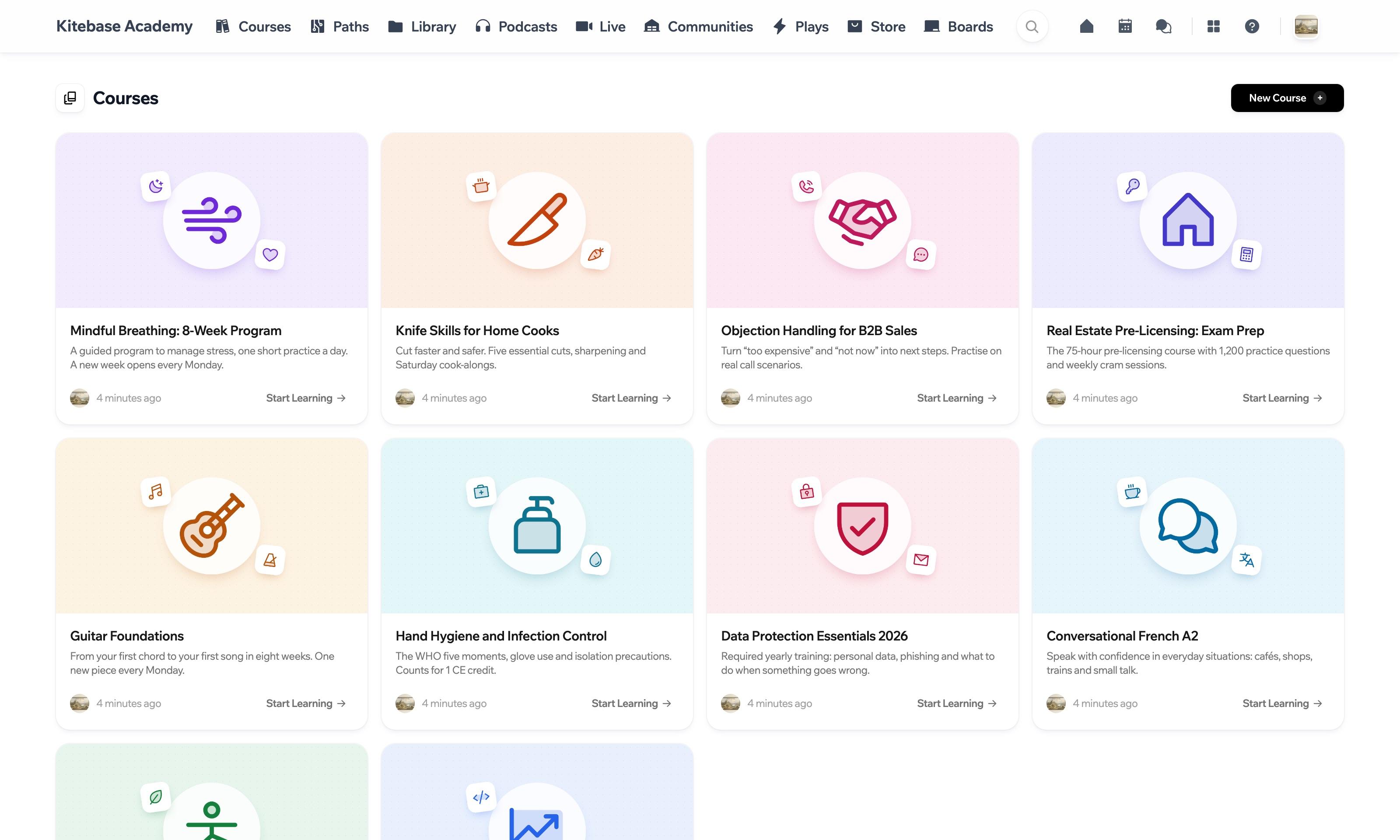
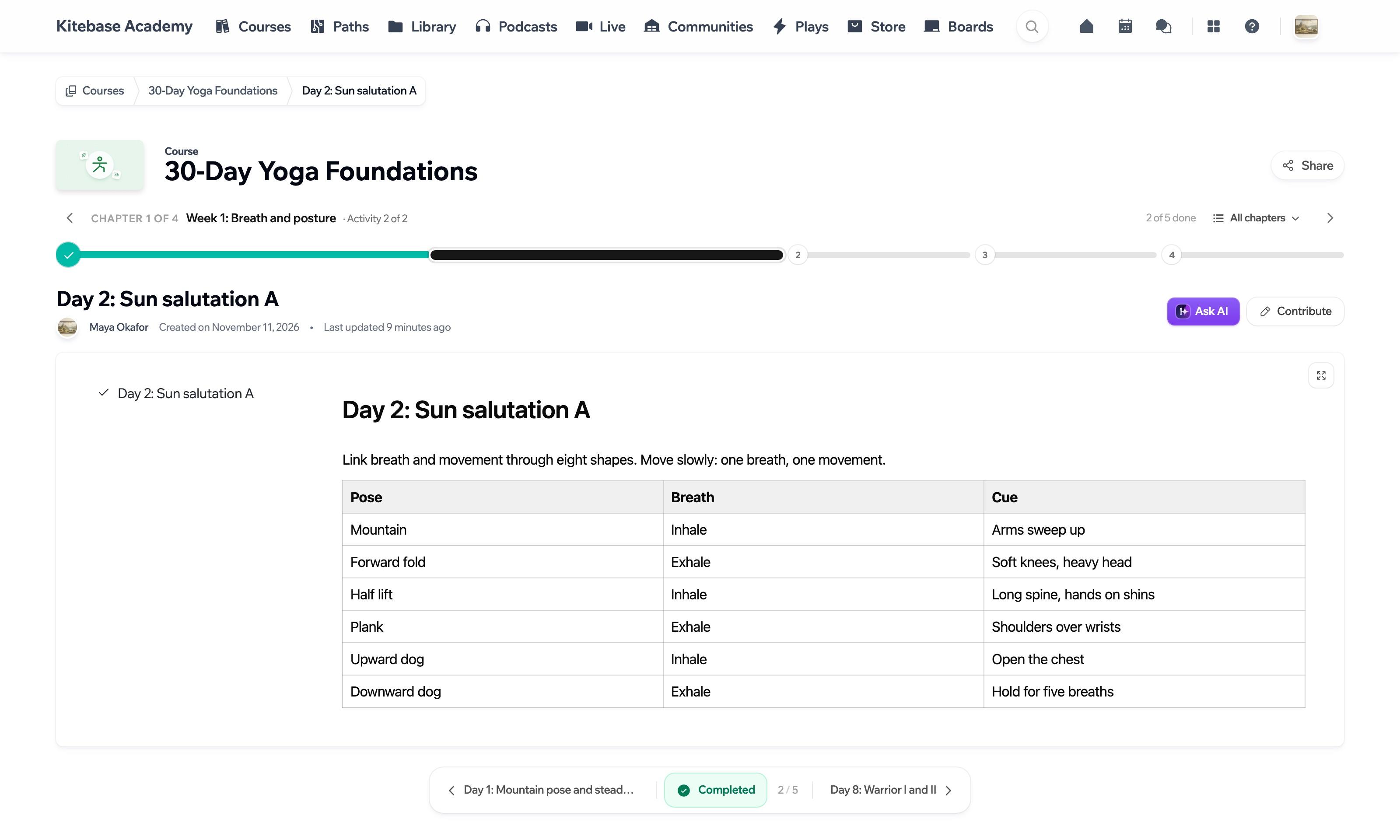
Text and tables share one column, under a line that shows where you are in the chapter.
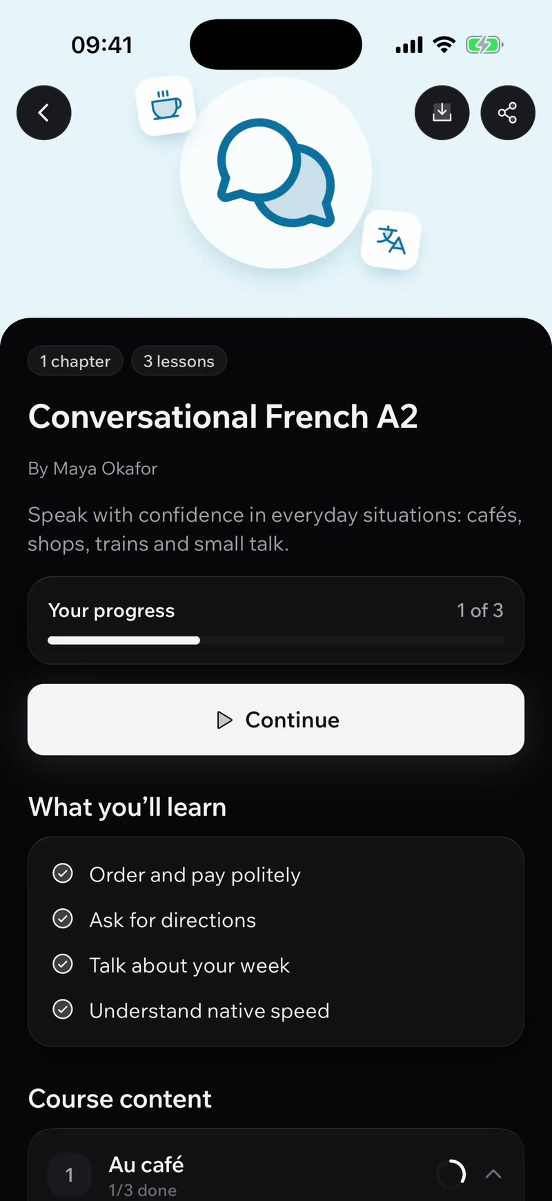
The mobile app is native on iOS and Android, with a tab bar, bottom sheets and downloads for offline use.
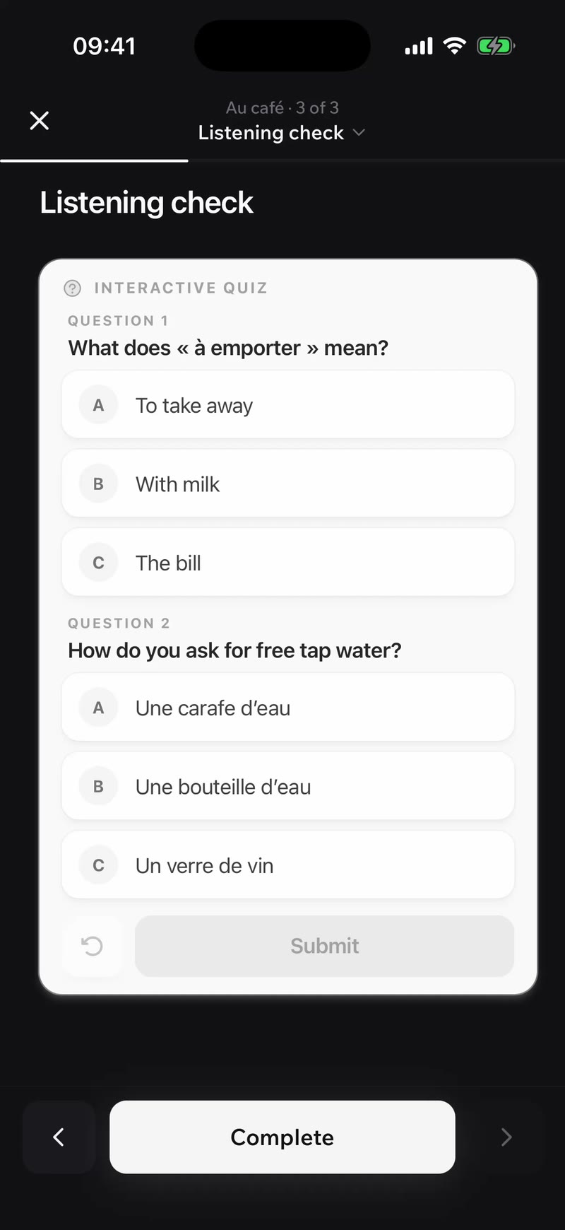
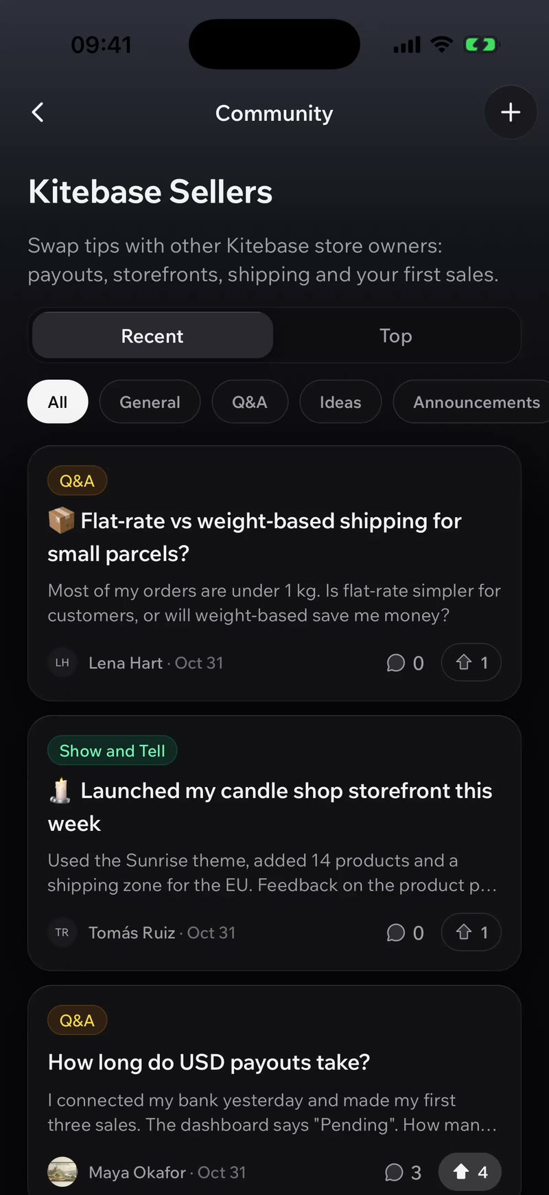
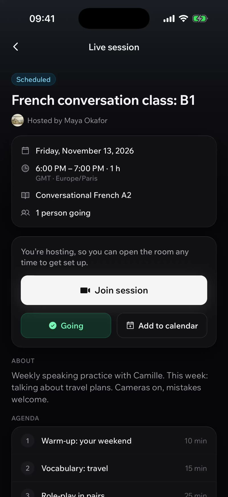
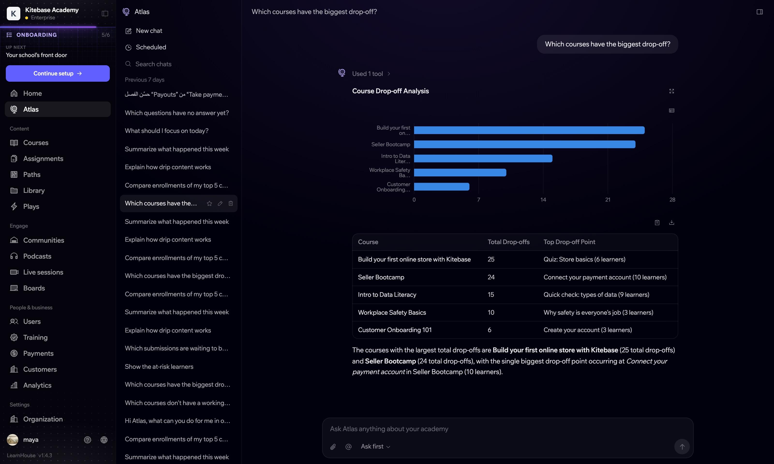
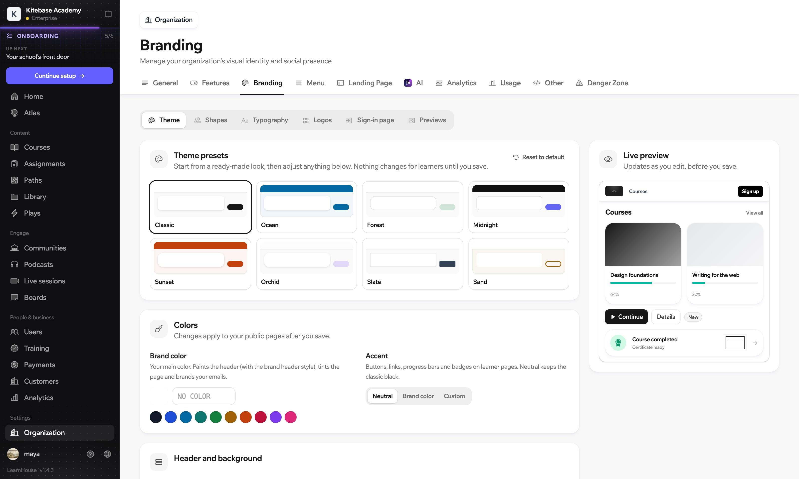
The AI agent and the brand settings are built from the same parts as every other screen.
These are server response times for the requests learners make most.
All four land in the first half of a second. Server response times measured on our own cluster in November 2026. Yours depend on where LearnHouse runs.
Buttons, tabs and hover states respond in 150 milliseconds. Floating bars slide in within 200.
While data loads you see blocks shaped like the content that replaces them.
A command menu takes you to another part of the dashboard without touching the sidebar.
The interface is translated into 22 languages, including Arabic and Persian.
Layouts mirror automatically and arrows flip, so Arabic and Persian readers get a proper right-to-left interface.
Every dashboard screen is built to work at 390 pixels wide. The page never scrolls sideways.
Focus rings are visible on buttons and controls, so you can see where you are when you tab through a page.
Light is the default and dark is your own choice in the user menu. It does not switch with the operating system.
Learner pages take your colours, shapes and typography. The dashboard stays neutral, so the tools read the same in every academy.
From the product. Sizes and gaps are measured on the screens shown, and the corner radius and timings come from the design tokens the interface is built with.
Creating a course, adding a lesson and grading a submission each happen in one dialog or panel, and a six-step launch plan on the dashboard home walks a new academy through setup. You can try it on a 14-day trial.
Measured on our own cluster in November 2026, the server answers in 173 ms when a signed-out visitor opens a lesson, 186 ms for a course's chapter list and 407 ms for a signed-in lesson. In the interface, buttons and tabs react in 150 ms. Your numbers depend on where LearnHouse runs.
Yes. The iOS and Android app is native, with a tab bar, bottom sheets and offline downloads, and the web dashboard is built to work at phone width.
Yes. The interface is translated into 22 languages and mirrors automatically for Arabic and Persian, including directional icons.
Yes. In the dashboard under Organization, Branding you can pick a theme preset or set your own brand colour, accent, shapes, typography and logo, with a live preview. Learner pages follow your theme. The dashboard stays neutral.
Yes. Light is the default and dark is a manual choice in the user menu or account settings. It does not switch on its own with the operating system.

Start a 14-day trial and build your first course.
No credit card needed
